App Re-design
Mobile App
Company
Sparkasse
My Role
Gpaphic Designer
Tools
Figma Miro Notion Photoshop
Timeline
2024 – 2024
Description
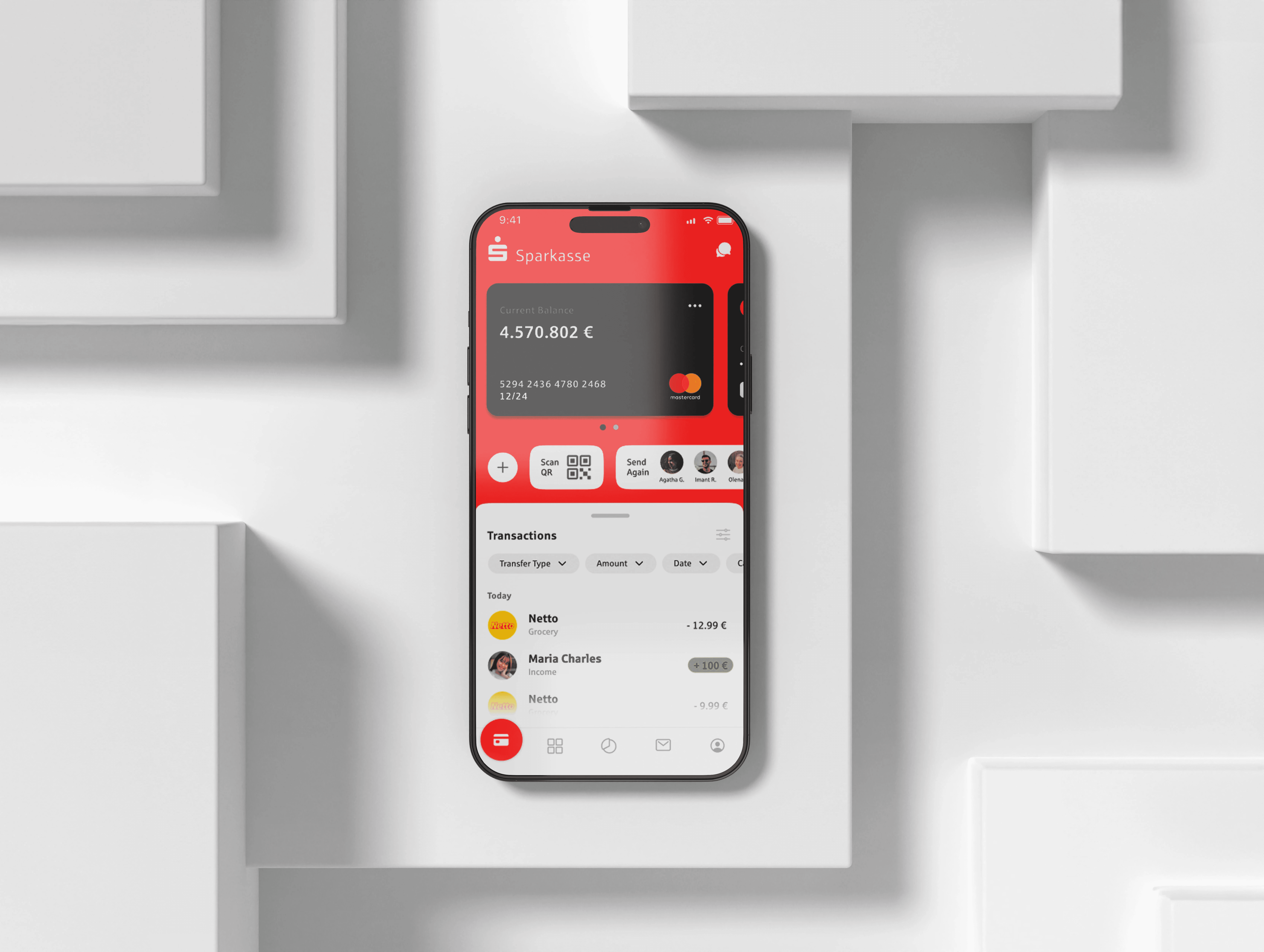
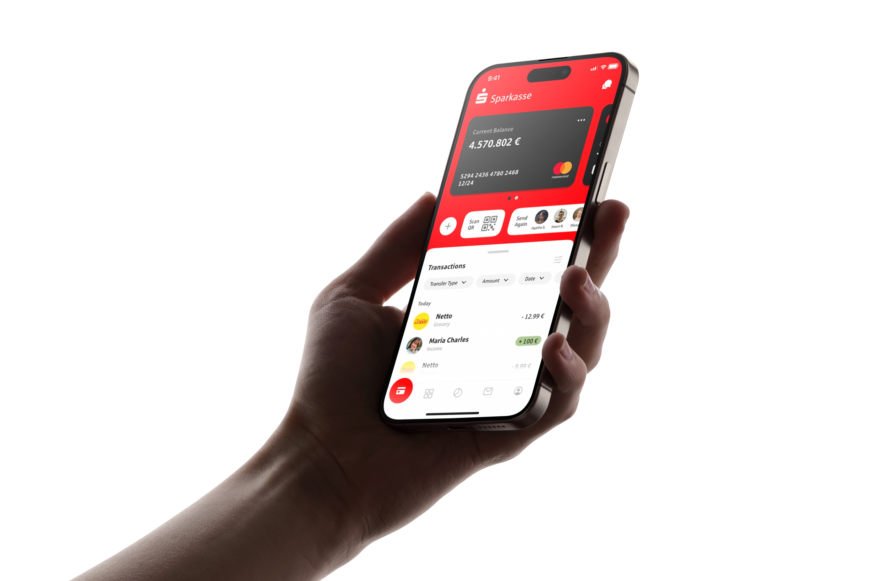
Sparkasse app has been revitalized with a modern redesign focused on enhancing user experience. The new interface features a streamlined home screen with quick access widgets, an intuitive transaction history filter, and a simplified money transfer process using visual cues for clarity and ease of use.
Context
Sparkasse, a venerable banking institution in Germany, faced challenges due to an outdated and cumbersome user interface, resulting in poor usability for its customers. This case study documents the journey of transforming Sparkasse's banking app into a modern, user-friendly platform.
Challenge
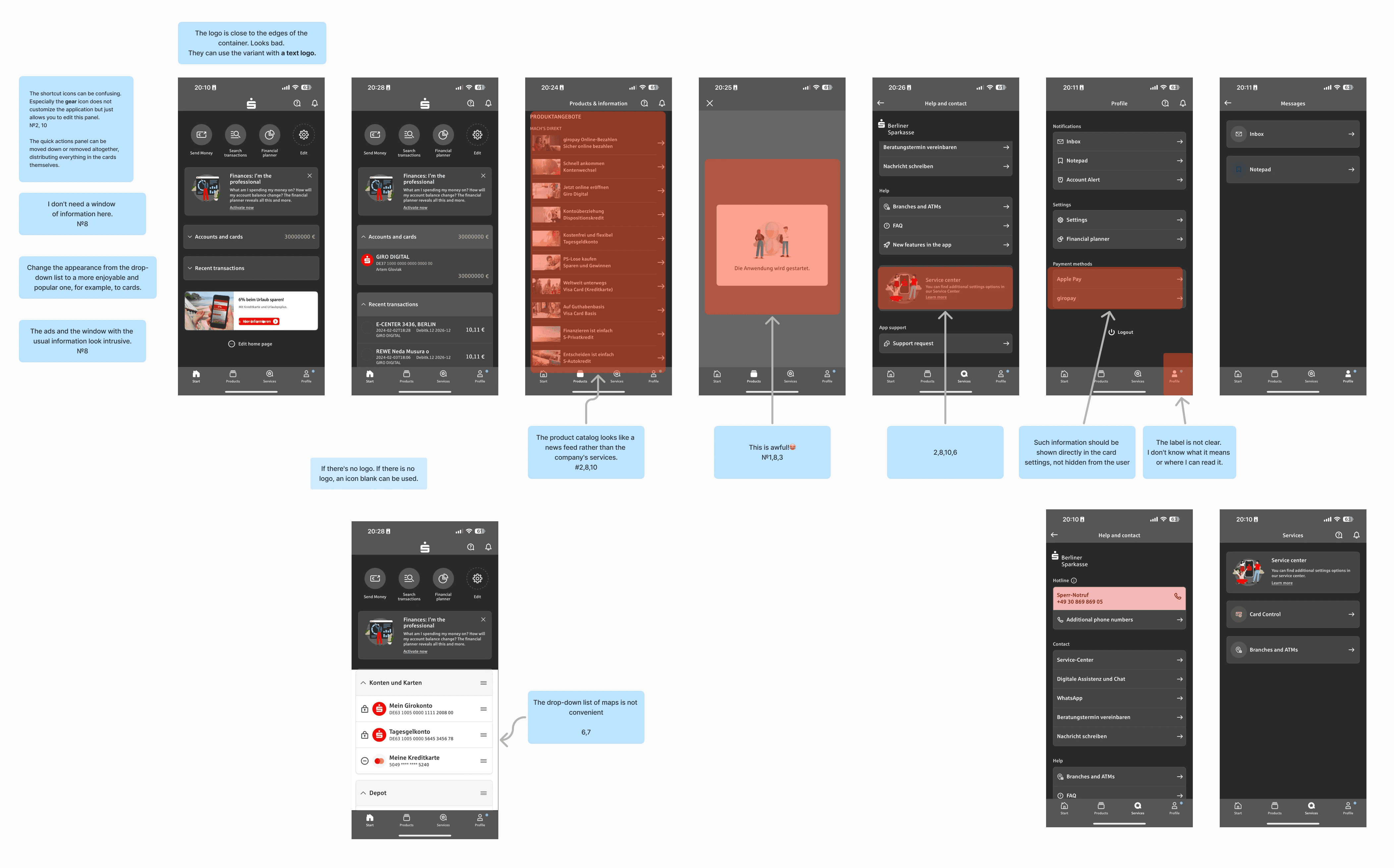
The main challenge in redesigning the Sparkasse app was updating its outdated and user-unfriendly interface while maintaining the bank's traditional brand identity. Specifically, the use of Sparkasse's signature red color, which users often associated with errors or warnings, needed thoughtful integration to avoid negative connotations and enhance the overall user experience.
Process
The redesign process began with extensive user and market research to identify the core issues with the existing Sparkasse app. Based on the insights gathered, the team brainstormed solutions and quickly moved into creating high-fidelity prototypes to visualize the new design.
Key elements such as a streamlined home screen, intuitive transaction filters, and a simplified money transfer interface were developed and iteratively refined through user feedback to ensure the final product met all usability and aesthetic goals.
Solution
The solution to the Sparkasse app redesign focused on modernizing the user interface and improving usability. The home screen was revamped to display current balances prominently and include quick access widgets for essential functions like transfers and QR scans.
The transaction history was enhanced with intuitive filters, and the money transfer process was simplified using visual icons and avatars to ensure clarity.
These changes collectively transformed the app into a more user-friendly and visually appealing platform, effectively addressing the initial challenges.

Takeaway & Reflection
The takeaway from the Sparkasse app redesign was the critical importance of aligning user expectations with modern design standards while respecting the brand’s heritage.
The process highlighted the value of user feedback in driving design decisions, ensuring that the app not only looked modern but also addressed specific user needs effectively.
Reflecting on the project, it was evident that careful consideration of color psychology and interface functionality could significantly enhance user satisfaction and loyalty in digital banking platforms.